A new project inside an existing brand
This is a common task, and it's easier to get wrong than right.
If a sub-brand stands out too much, people don't connect the project with the association behind it. If it blends in too much, the project has no identity of its own and looks like just another post. We had to hit the middle.
So the colours and shape of the logo couldn't stray far from what Switch was already using.
The logo
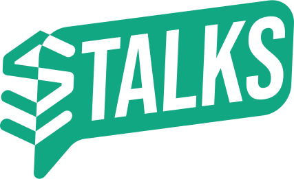
We built the logo from two parts the audience already knew.
The first is the S mark from the Switch association's favicon, so it's immediately clear whose project this is. The second is the word Talks. Everything sits inside a speech bubble, because Switch Talks is essentially a conversation, a kind of live podcast. The shape carries meaning, not just form.
It's rendered in the existing green brand colour and delivered as a clean vector with the text converted to outlines. That means it opens the same everywhere, without anyone on the other end needing the same font installed.
Colours and typography
Alongside the logo we defined the project's colour palette and typography.
This is the part that most often gets skipped, and without it an identity doesn't survive. A mark on its own doesn't tell you what a poster looks like, what a post looks like, or what to do when something new is needed and there's no designer around. Rules solve that.
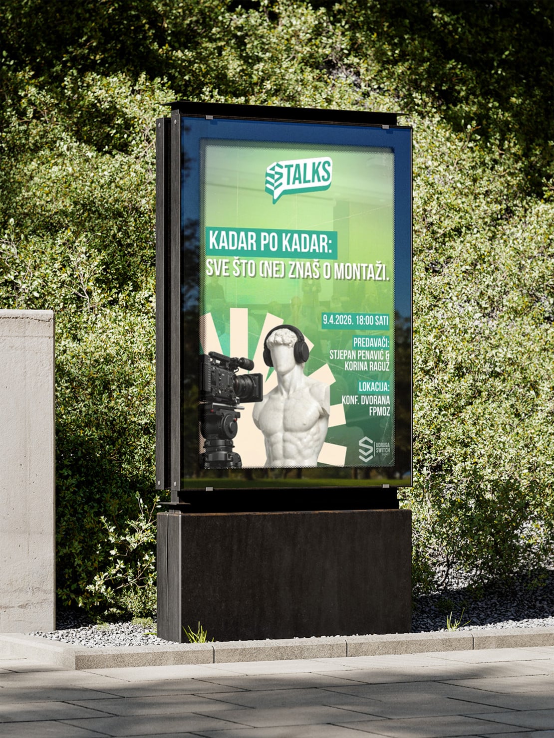
A poster that became a template
Once the identity was done, the first episode came along.
It needed a poster that did two things at once: look good graphically and, as an invitation, actually bring people to the event. We designed it so it would immediately become the template for every following episode.

The first episode was about filming and editing, so the poster carries elements of videography. Each following one carries elements of that episode's topic, while the layout, typography and colours stay the same. That way the series has a recognisable rhythm, and each episode still says what it's about.
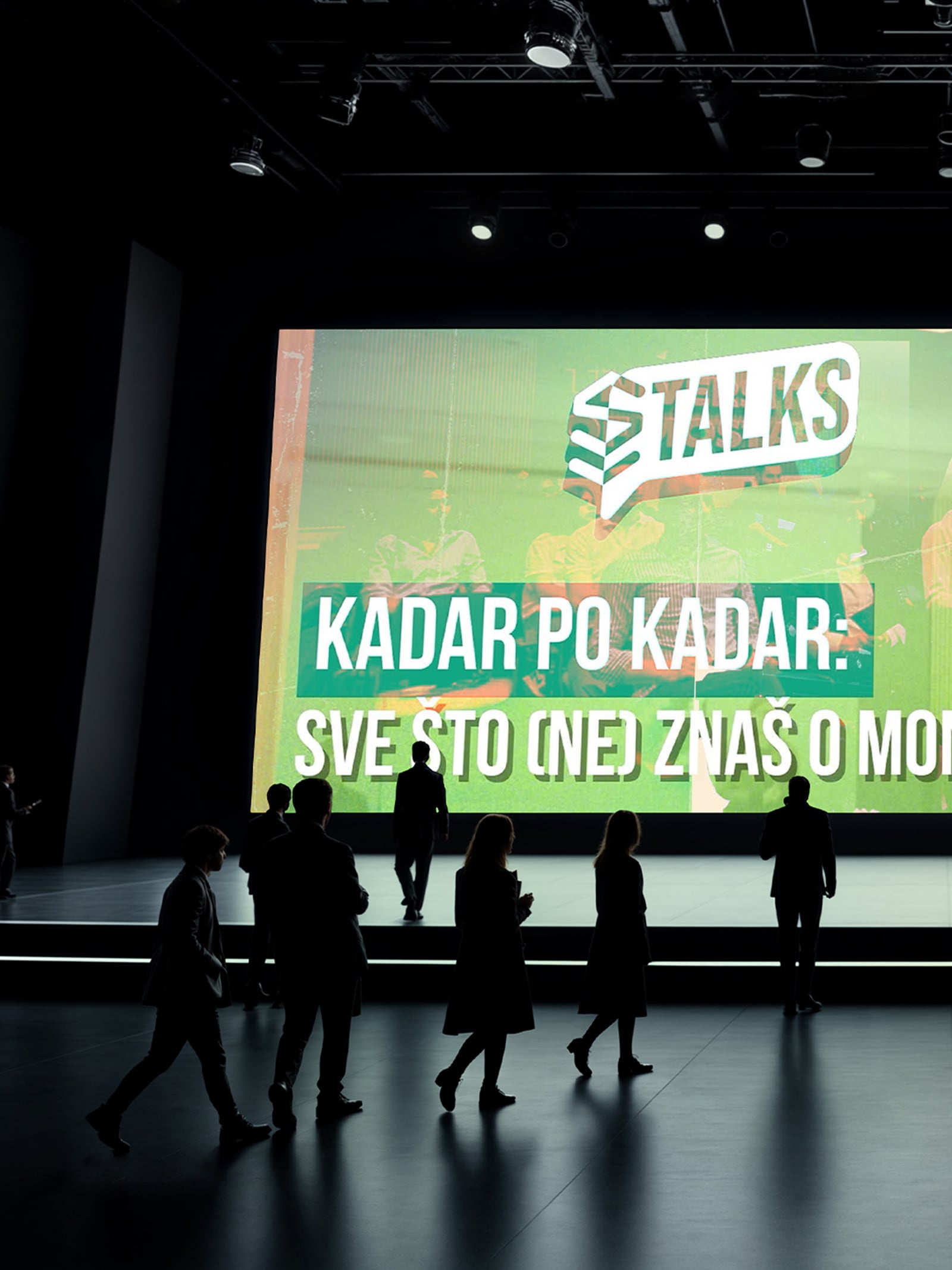
Presentation templates
To finish, we also prepared a slide template used at live events.
That closed the circle. The mark, the rules, the poster and the presentation speak the same language, so the association can keep the project going without starting from scratch every time.
Want the same for your brand?
We thank the Switch association for their trust and wish them many more successful projects.
If your brand needs a logo, a visual identity or rules everyone will use the same way, get in touch through the contact form, by phone or on any of our social media channels.
Let us start your brand's evolution.