
Three places where the choir meets its audience
A choir doesn't present itself in one place but in three, and all three look completely different.
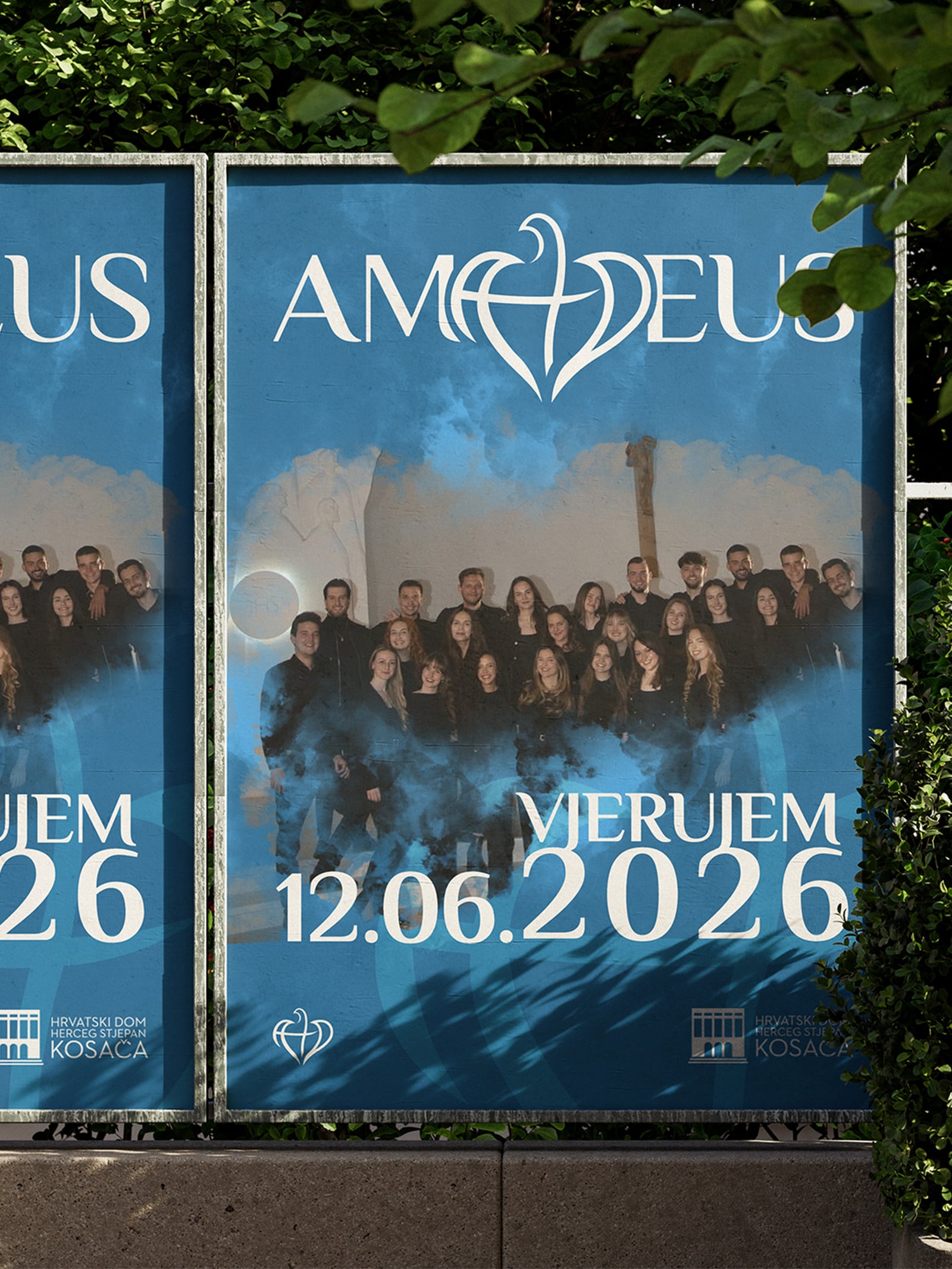
Someone first sees a concert poster on a wall. Someone else a post on Instagram. Someone else the choir's name on an official letter to a parish, the city or a sponsor. The poster, the post and the letter have almost nothing in common: not the format, not the tone, not how long anyone looks at them.
The identity's job is to make those three encounters the same choir. So we looked for a direction that is gentle and elegant, as suits a choir, but simple enough to survive the move to each of those formats.
A bird hidden in the name

At the centre of the logo is a stylised bird whose wings form the letters A and D in the name.
So the mark and the name aren't two things standing side by side but one whole. The bird is written into the word, so you can't separate it from the name even with your eyes.
It can, however, be separated on purpose. The bird shape stands on its own without the name, which solves the profile picture and every small mark where the full name would be unreadable. The choir has two versions and a clear rule for when to use which.
A poster has one job
It's worth being direct here, because this is where concert posters most often go wrong.
A poster has to be beautiful, but that isn't its job. Its job is for the person walking past to know where, when and at what time. If the poster is gorgeous but someone has to stop and look for the date, it hasn't done its job.
So we used examples to show how photos of the choir, text and graphic elements come together in a layout where the place, date and time are found first. Elegant lettering carries the name and a simpler typeface carries the information, and that split isn't aesthetic, it's functional.
Blue and its lighter tones give it all a cheerful feel, which suits a youth choir.
From official letters to T-shirts
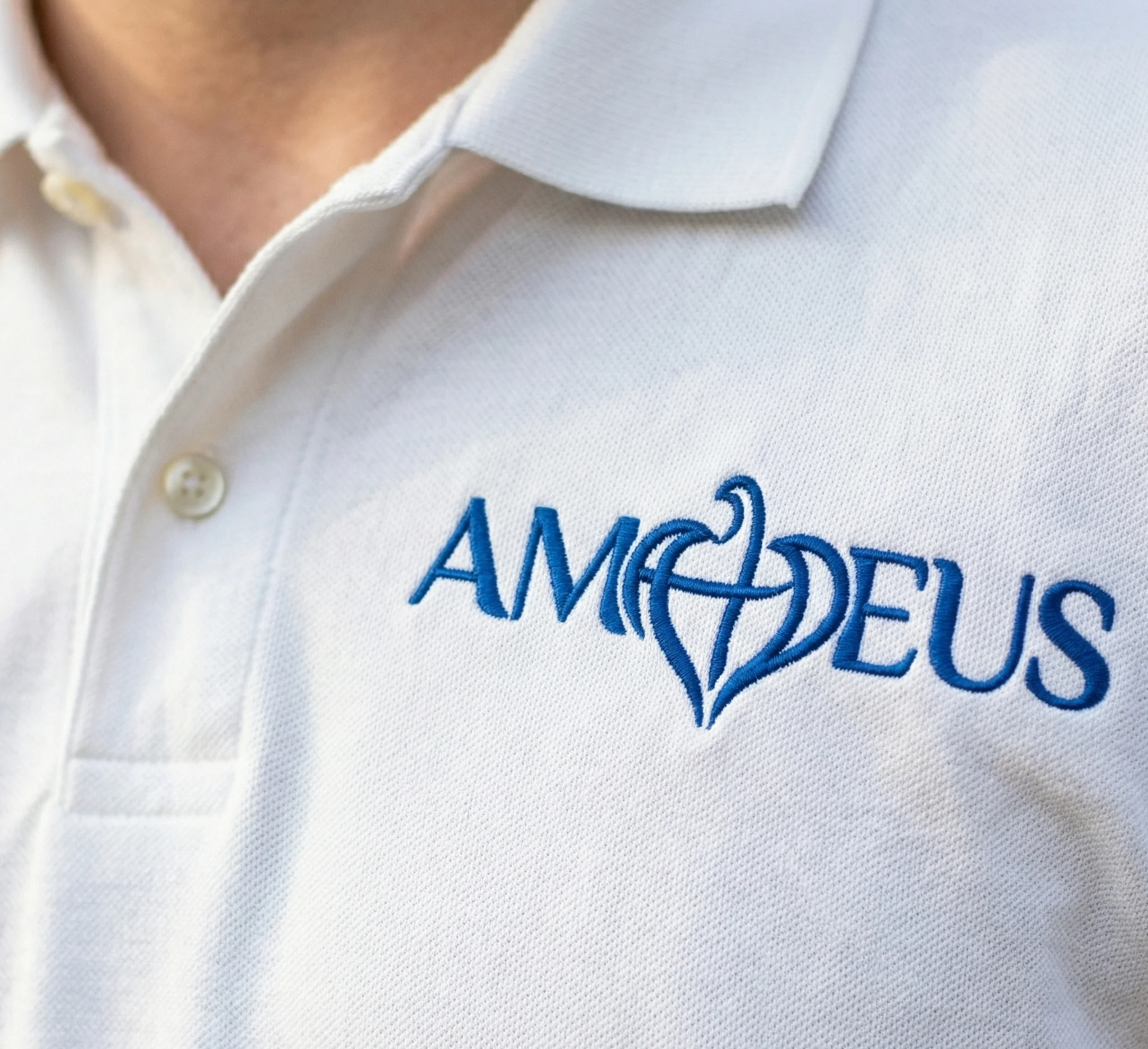
We developed the identity across letterheads, notepads, business folders and a stamp, then posters, T-shirts and a promotional stand, and finally templates for posts, stories and cover photos on social media.
The list sounds long, but each of those items is a place where the choir appears in front of someone. The letter goes to the parish or a sponsor. The T-shirt goes in front of the audience. The post goes in front of everyone else.
The brand guidelines are what stays
We brought everything together in brand guidelines: colours, typefaces, logo versions and the rules for using them.
This is the part that most often gets skipped, and without it nothing that came before survives the first year. A mark on its own doesn't tell you what the next poster looks like, or what to do when something new is needed and whoever designed it isn't around. The rules are the answer to that question, written in advance.
Today Amadeus has a recognisable look and guidelines that give every new concert and every new post the same starting point.
Want the same for your brand?
We thank the Amadeus Youth Choir for their trust.
If your choir, association or project needs a logo and a consistent look for its materials, get in touch through the contact form, by phone or on any of our social media channels.
Let us start your brand's evolution.