When a band is just starting, its identity is all it has
This is the difference between a new band and one that has been playing for ten years.
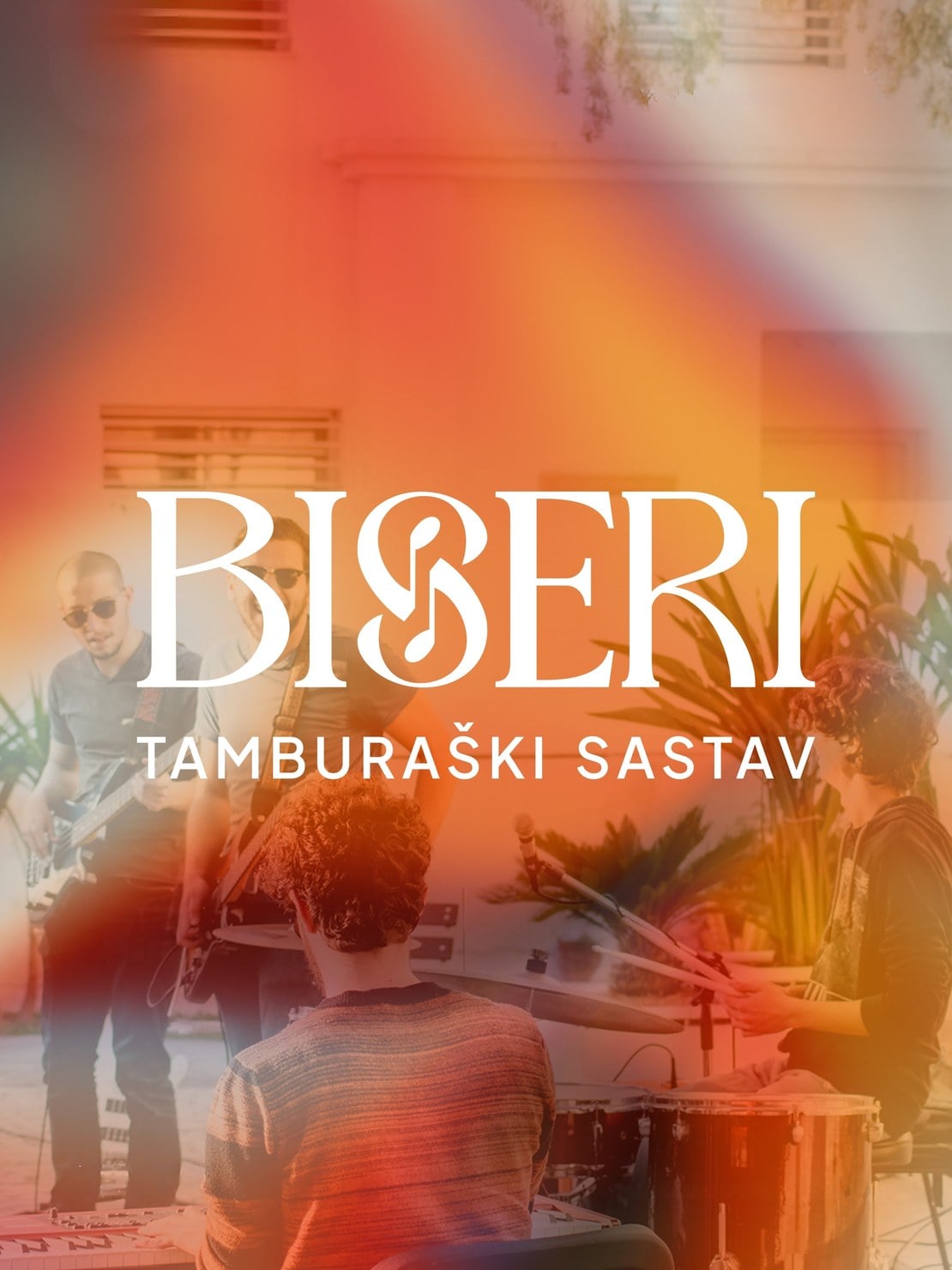
A band with a history has recordings, photos from gigs and people who already recommend them. A new band has none of that. The first encounter with the audience is almost always visual: a post on social media, a gig announcement, a T-shirt on the members.
So here the identity isn't decoration but a first impression in the full sense of the word. It's the only thing about the band that exists before anyone hears them play.
A note and a tamburica in the letter S
We built the link to tradition into the name itself, not next to it.
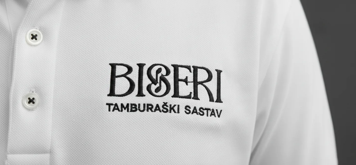
Into the letter S in the name BISERI we worked a stylised combination of a musical note and a tamburica. So the musical motif isn't an add-on to the name, it became part of the name. Whoever notices it sees what it's about before reading the subtitle.
That detail can be pulled out and stand on its own. That wasn't an afterthought but a requirement, for the reason that follows.
The mark has to work at the size of a profile picture
A new band lives on social media, and there the mark is a small circle.
The full name in that circle becomes a smudge. So we shaped the detail from the letter S to work on its own too, as a profile picture or a small mark. The band has two versions carrying the same recognisable element, chosen according to the space, not according to whichever one was to hand that evening.
Without that second form, every small application becomes improvisation, and the identity falls apart exactly where most people see it.
The warmth of wood and elegant lettering
For the name we chose the Ophelia typeface, and Plus Jakarta Sans for supporting text.
The roles are clear. The name draws attention, the other information stays easy to read. When a poster announces a gig, the place, date and time have to be readable in passing, so there elegance gives way to legibility.
We complemented the black and white base with a warm brown, the colour of the wood the instruments are made from. So the link to the tamburica comes through the colour too, not only through the mark.
How it looks in practice
We worked the standards out through the applications the band actually uses.
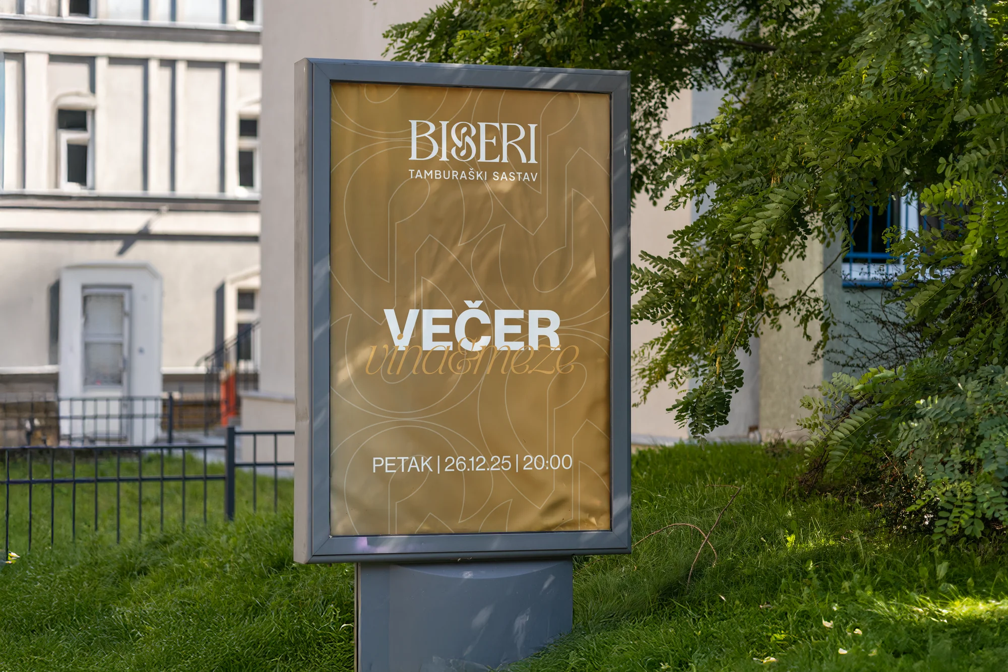
Social media posts, gig announcements, business cards, clothing and promotional materials. Each of those formats has its own limits, and that's exactly why the rules exist: so whoever makes the next post doesn't have to guess.
What Biseri got
A band that started with nothing behind it now has its own visual signature and rules for using it.
Every new announcement starts from something that already exists, and the musical detail in the name connects all the materials to what the band actually plays.
Want the same for your music project?
We thank Biseri for their trust and wish them many good gigs.
If your band or project needs a logo and a recognisable look, get in touch through the contact form, by phone or on any of our social media channels.
Let us start your brand's evolution.