Rules first, then everything else
We started with the identity, and that order wasn't a matter of taste.
The website, a document and the lettering on a vehicle have to look as if they come from the same place. If that isn't sorted out first, every next thing carries its own version of the same thing, and the differences pile up until nobody knows which one is right.
So first we defined the logo, colours, typefaces and the rules for using them together. Everything that came after rested on that.
A logo that comes from the craft
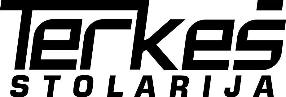
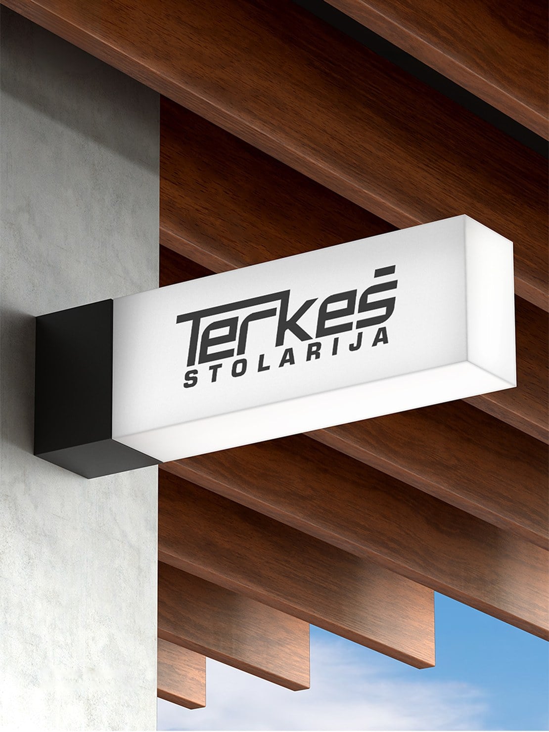
The mark is shaped with strong letters, extended lines and precise cuts that recall woodworking and joinery joints.
Below the name sits the spaced-out word STOLARIJA, Croatian for joinery, so the trade is clear even to someone hearing the name for the first time. Warm colours go with the character of the mark and with the material the workshop works with.
This isn't decoration but a shortcut. A mark that looks like what the company does saves a sentence of explanation every time someone sees it.
Where a joinery workshop is actually seen
This is the difference between a joinery workshop and, say, a software company.
A workshop's brand is most often not seen on a screen. It's seen on the van parked outside the house where they're working, on work clothes, on signage, on the folder in which the client receives a quote and on the invoice that arrives at the end of the job. These are encounters with the client that happen even when nobody is looking at the website.
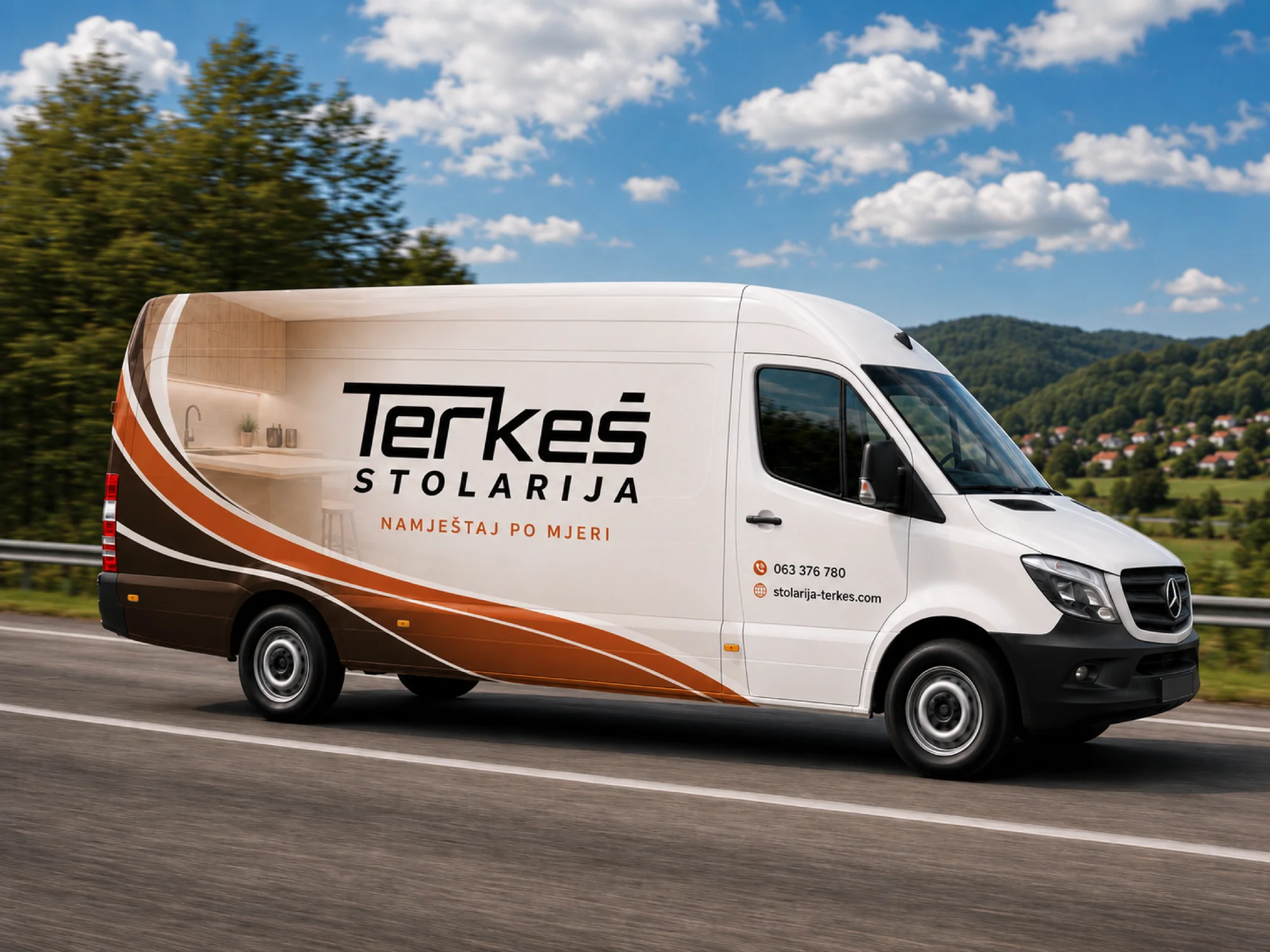
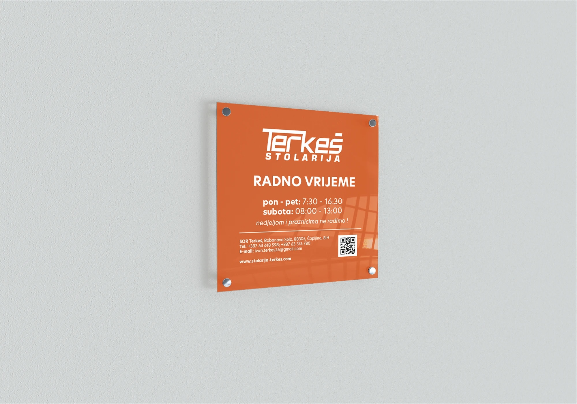
So the brand guidelines didn't stop at colours and typefaces. We worked out the application on business documents, business cards, folders, signage, vehicles and work clothes: exactly the places where this company actually comes face to face with people.
A website where the work does the work
We then carried the identity over to the website.
At its centre are the services and completed projects. Anyone looking for a joiner is looking for proof, and the proof is furniture already installed somewhere. So the project gallery is the backbone of the site, not an extra at the bottom.
The rest of the site leads to one thing: an enquiry. Visitors see what the workshop does, see what it looks like, and have a clear path to get in touch about their own project.
Spreadsheets and paperwork around the workshop
The third phase goes beyond what you'd expect from an agency, so it's worth explaining from the start.
Until then the paperwork was kept in Excel and by hand. Invoices in one spreadsheet, pro forma invoices in another, other notes across various documents and pieces of paper. It works while it works. The trouble starts when you need to find an invoice from a year ago, when two versions of the same spreadsheet drift apart, or when a number is copied wrongly somewhere and discovered months later.
So we built an internal system for creating and issuing invoices and for keeping records of invoices and pro forma invoices. Everything in one place, in one format and with one sequence of numbers.
The logic behind it is simple. An invoice and a pro forma invoice are documents the client holds in their hands, so they are also an encounter with the brand, just like a business card or a folder. If they are issued through a system built alongside the identity, they come out neat and consistent without anyone having to think about it.
What remained at the end
Today Stolarija Terkeš has a consistent visual identity, rules for using it, a website that shows its work and a tool for running its paperwork.
The collaboration covered the whole journey, from how the workshop presents itself to the part of the business that happens behind the scenes.
Want the same for your brand?
We thank Stolarija Terkeš for their trust through all three phases of the project.
If your company needs a new identity, a website or a tool for a specific business task, get in touch through the contact form, by phone or on any of our social media channels. Together we'll work out where it makes most sense to start.
Let us start your brand's evolution.